Friday, August 29, 2008

Shady Behavior

Not that kind of shady behavior, silly!

Obviously, we at Swank Lighting are passionate about lighting in all of its glorious forms, in particular, lamps! Before I started blogging with Swank, I worked at a local lamp shop called Lamps and Lighting where I learned about the intricacies of lamp making and, equally important, lamp shade fitting. It is truly a travesty to look in well-known interior design magazines and see these amazing, professionally designed spaces, with ill-fitted lamp shades on beautiful lamps! I learned from the best, and I want to pass along my knowledge to you. Hopefully we can stop the epidemic of poor shade choices that seems to be spreading the country!

First off, lets talk about the difference between hardback and softback shades. If you have a dressier lamp, or are placing your lamps in a more formal setting, opt for softback shades, meaning the shades will be silk or fabric lined. They are almost always more expensive, but the look is more luxurious. On the flip side, softback shades are more prone to dry rot, which occurs when the heat of the bulb dries out the lining and causes it to shred. This is almost impossible to repair, because once dry rot starts, shades begin to deteriorate and there is nothing to patch onto. If you decide to choose a softback shade, make sure you either use a low-watt bulb, or at least a smaller bulb, such as a torpedo bulb, which puts off the same amount of wattage but less heat because it sits further away from the shade. In my experience, it is nearly three times more expensive to have the original shade repaired than to buy new shades, so keep this in mind when searching for shades.

Hardback shades are the second option. A more casual, relaxed option that is perfect for a more casual space, hardbacks last longer and are more affordable. Hardback shades are great for basic lamps, and also work well for retro lamps. Pottery lamps that are more rustic look fabulous with burlap, textured shades, and brass lamps are especially sharp looking with a black paper shade with a gold or tortoise-shell lining. Anything clear, such as popular glass or acrylic lamps, though usually more formal, can take a hardback shade if in a more casual or modern setting. It really depends on the look you are trying to achieve in the room- as a basic rule of thumb, hardback= casual, softback= formal.

Well, you have your basic knowledge of shades, now back to the important task of fitting them properly! Remember this: half of the neck needs to show. What is a neck?


A neck is the part of the lamp between the actual piece that is made into a lamp and the socket. You never want the socket to show, and you never want to cover the top of your lamp. See some examples below.

The bad examples first- the shade is either too high or too low.


Now the good examples, where the shade sits at the proper height, allowing half the neck to show.


How can you achieve this? With the correct harp! The harp is the u-shaped piece that fits into the saddle located at the base of your lamp's socket, which your lamp shade sits on. There are several sizes- from 5" to 14". There are also low-weight and heavy-weight harps, which really cannot be determined unless you bring your lamp to the store and fit it yourself.

When searching for lampshades, it is very important to bring the lamp with you if possible. This will save you several trips back and forth from shops, and a lot of headache. With the experience I have, I still wouldn't be able to eyeball what shade I need for a lamp, and more importantly, the correct harp size. Also be sure to tell the consultant if you need a pairof shades as early as possible- trust me, nothing is more heartbreaking than finding what we would refer to as a "onesie" that we fell in love with, only to discover that the client needed a pair!

New shades can make a tired lamp look brand new. With proper care, shades can last up to 30 years, it all depends on the wattage of the bulb, the size and fabric the shade is made of, and of course a proper fit. Taking your lamps to a specialty shop might cost more initially, but like everything in life, you get what you pay for- quality!

The best brands, such as Silk-O-Lite, Royal Knight, Lakeshore Studios, and Canterbury-Roseart, are only available to the trade, so they will only be available in retail locations. For online sources, see the links listed below.
Moonshine Shades for funky fiberglass reproduction shades.
Alluminaire for contemporary drum and square lamp shades.
Pottery Barn has excellent basic hardback shades, including black and textured options.


Enjoy!
- Genevieve at Swank

Featured Store: Oppulent Items

Ever have one of those "aha!" moments when you finally discover what you've been missing? Or see something so simple and practical, leaving you thinking, "Now why didn't I think of that?" When Ed emailed me about the online store Opulent Items, and asked me to review it, I was immediately in love. This site features the most unusual and unique merchandise and experiences, including indoor and outdoor home, personal, play and office.

This site is very easy to navigate and is filled to the brim with goodies, so because of this, its not a quick browse- I would suggest checking it out in the evening or on a long lunch break. There are too many cool things to read about to not give it the time it deserves. A few of my favorites are the Dog Peek, Aerial Dinner, Plant Wall and Virtual Butler. Some pictures are below, just a small sampling of the awesome things available at this store.

If you want something special for yourself or a hard-to-buy-for person, check the site out and get inspired!
-Genevieve at Swank

Friday, August 22, 2008

Swank Lighting Welcomes Our First Retailer

We’re happy to announce that Swank Lighting’s new line of contemporary lamps are now being sold at AREAin Austin, Texas.
We’ve posted here about our new Joe Cariatiline of hand blown glass lamps and our recycled glass lamps ‘Rock Candy’. Now we have started rolling these products out to fine home furnishings stores. Look for them in your town soon.
Here are a few photos from AREA.

Sunday, August 17, 2008

Contemporary Lighting Designs from Swank

As many of you know, we at Swank are obsessed with decorative lighting. When we started Swank Lighting a few years back we were intending to simply sell rebuilt vintage lamps and specifically our large supply of Murano lamps. It was a semi retirement kind of business.

We started on eBay and eventually moved from the high pressure environment of Los Angeles to the comfortable, laid back, hippie town of Austin, Texas looking for a little quiet and tranquility. Well so much for that.
After about a year in Austin, we launched our own web site and opened a showroom in Dallas. Then we started playing around in the Swank studio with different ideas we had for great lamps.
Recently we announced our new line of American hand blown glass lamps by Joe Cariati, and now we want to give you a sneak peak at a few other lines we are working on.

Pictured below are two pair of our new Recycled Glass Line which we are calling Rock Candy. And below that are some new photos of lamps from the Joe Cariati line. Then we close with some shots of a new design from our Swank Naturals line where we use natural stone and mineral specimens. In this case we have Tangerine colored Honeycomb Calcite with Acrylic designed by Matt Wojchowski of Austin.


Currently swanklighting.com is being redesigned to accommodate all of these new beauties, including full e-commerce capabilities. The new swanklighting web site is scheduled to go live this October. Until then I will occasionally post updates showing some of the products we will be selling.

I hope you appreciate the love and hard work, and fun that goes into the Swank line of products. Anyone who has ever purchased or seen our lamps in person can’t believe the quality that is built in.

More to come. Please email us your feedback. We love hearing from you.

Also if you have ideas for lighting design that you would like to take to the prototype level send us an email or call. The contact information is on our “about” page.

Thanks
Ed at Swank

Thursday, August 14, 2008

Happy Birthday Mrs. Blandings!


One of our favorite bloggers and a good friend of Swank turns 1 today. I first met Patricia last fall when she was only a few months old. She was surprisingly wise and conversant at such a young age. She must have also been pretty good at SEO (search engine optimization) because Mrs. Blandings was already bubbling to the top of my frequently searched google pages.
Being fairly young ourselves at Swank Lighting I was looking for all the free P.R. I could find and immediately I started hounding Patricia to blog about Swank. Well eventually I wore her down and thanks to her post and those of many other blogger friends Swank has also started bubbling to the top of a few google search pages.
Without getting too personal, because I really don’t know Patricia outside of email and the blogosphere, She lives in Kansas City with her Husband (whom she refers to as Mr. Blandings) and her young sons. She has a beautiful home which she allows us to peak into occasionally and a wonderful sense of style and taste presented with a big dose of humor.
Hop on over and wish Mrs. Blandings a happy first birthday. Trust me, it will be as much of a treat for you as for her.
Enjoy!
Ed at Swank

Wednesday, August 13, 2008

Scheming with Color: The Cool Ones

Think back to the first time you opened a fresh box of Crayolas. I can still imagine that waxy smell, and how very careful I would be when using them to preserve that pointy tip. Instinctively reaching for a particular color, which for me was always a red or pink, I would color to my heart’s content. Little did I know that my first artistic experiences with crayons would eventually turn into a desire to work in the art and design community, with a love of color still a driving force. The psychology of color has always intrigued me and I want to share some insight with you… I think you will be very surprised!

Let me take a wild guess… is your favorite color blue? Blue is the overwhelmingly popular color of choice. This might be attributed to its constant presence in our lives, either with a blue sky or blue ocean. It is considered a gender-neutral color, making it a popular color choice that pleases nearly every taste. Known to calm senses, give a feeling of cooler temperatures, and possibly heighten intuition, it can also come across as cold and sterile when used too much. More intense punches of blue express exhilaration. A few examples follow- note the use of blue in the space and how it is offset with other colors.


Even though we are surrounded by blue in nature, few foods in their natural state are blue in color. Eating food on a blue plate or even a blue room is known to suppress appetites because we are turned off by this “artificial” color. This might be great for those times when we diet, but for a dinner party, perhaps opt for the warmer and neutral colored dinnerware. If you are painting your dining room, kitchen or a restaurant, steer clear of this color. This color works best in bathrooms and bedrooms.

Green comes in as a very close second, and occupies more space in the spectrum that is visible to the human eye. If you are unsure what color to paint your space, and don’t want to go with a neutral, choose green. Humans innately connect to greens because of its constant presence in our lives through nature. We feel comfortable in a green space, and because of this it is the perfect prescription for someone who might be feeling anxiety or depression. Moods are boosted and feel renewed in a green space. Some great examples are below.


Green has taken on a new meaning in recent years as the symbolic color of sustainability. No doubt you have heard of low VOC (Volatile Organic Compounds) paints, which are becoming more readily available to the public. You can literally practice Green Design habits while painting those walls green!


Purples are perhaps one of the trickiest colors of all. It is a mix of calming blue and stimulating red, so it can perhaps give a sense of uneasiness because it embodies contradicting qualities. When choosing purple, lean towards a very blue or very red version of it according to what mood you want to achieve in the space. It also has spiritual connotations because it is often used in religious interiors and rituals. It can be known to heighten creativity, so this would be an ideal choice for a work space or even a space where children play. It definitely appeals to a more artistic crowd. If you want to show your eccentric side, go for it and choose purple!

Purples are also very regal and can look very sophisticated when used properly. I prefer this color on furniture and accessories. Use on one or two pieces in a richer shade for a more mature, luxurious look. Sometimes when a room is painted a lighter purple, it can appear too juvenile looking. If you are set on using a lighter purple, be sure to have masculine elements to offset the look of a too-girly space.

This covers the cooler end of the color spectrum, but next we’ll heat it up with the warmer colors, and then show you how to make neutrals as high impact as their colorful counterparts. Until then, feast your eyes on some of our cool colored Murano lamps to add colorful punches to your space.


Enjoy!

-Genevieve at Swank

Tuesday, August 12, 2008

Designer's Best Friend

I love my dogs. Those who know me are saying, Duh, dude - tell us something we didn't know! I have pictures of several of my dogs tattooed on my body. Years ago I told my mama I wanted to get a tat of my beloved Pit Bull, Magurk. Her response? Oh Douglas, can you imagine how silly you'll feel when your my age? Well, mama, I am your age now, and I don't feel silly - I only feel like it's time to add Peabo the Pit Bull to one of my limbs.


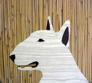
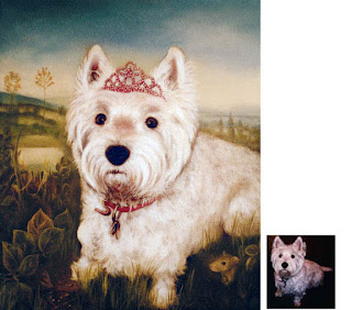
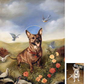
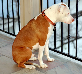
I remember going to a fund raiser at The Playboy Mansion back in the eighties - the charity of choice was an animal rescue group. One of the items up for auction was a commission by artist
Beau Bradford to do a portrait of the winner's pet, and I won. My assignment to Beau... make Magurk a star a la Andy Warhol. Check out the wonderful nine panel painting I have hanging in my living-room today.

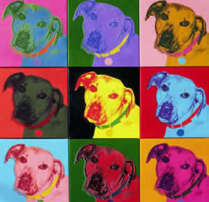
Genevieve is also a pet lover and pet art lover. Check our the article below on some of her favorite pieces.

Doug at Swank

A few months ago, I had to move into a house that isn't exactly "pet friendly" and I'm beyond lonesome for my best buddy, a miniature daschund named Moose. I don't know if this is the reason why I'm noticing a lot more dog art and motifs in the design world, but I can't get enough of this super cool trend.
Maybe "trend" isn't the right word... dogs have been featured in the art world for centuries. Take Foo Dogs, for example. A pair of Foo Dogs (most likely the glazed turquoise kind) has become almost a staple in any Hollywood Regency space, but their original purpose was to guard Buddhist Temples and government buildings in China. They are believed to have first appeared during 208 B.C. - 221 A.D., and were most likely modeled after the Chow breed for their lion-like appearance. "Fo" is the Chinese word for Buddha, which is a possible origin for the Foo Dog name.
I found an excellent blog called Dog Art Todaywhich lists notable artists and designers, starting in the 14th century. Among notables such as Pablo Picasso and Andy Warhol, who often featured their own miniature daschunds in their works, are several contemporary artists who feature dogs as their central theme. Two of my personal favorites are Amy Turner and Luis Ramos, both of whom do pet portraits with a twist. Amy Turner's website showcases her wood-grain pet portraits which are very graphic design in nature. The boldness and simplicity of them is what I find most appealing; especially the way she manipulates the wood-grain to simulate different textures and colors - definitely worth checking out. Luis Ramos looks to the past and his Spanish heritage for the inspiration behind his neo-classical portraits. His business is called Petcasso, painting your loved pet into a most regal setting. Perfect for the very pampered pet.


Other ways our four-legged friends have been incorporated into our interior spaces are through funky fabrics and pillows. Crypton and William Wegman, famous Weimaraner photographer, recently launched a line of dog-inspired prints. Crypton fabrics are impervious to stains and are often used in the health-care industry, but are perfect for places where your pet likes to lounge, even available for slipcover applications for your own furniture! I also found some super cute pillows, which are shown below. Sketchy, Needlepoint, screen printed, or graphics, there's a style to fit every space.
So whether you're lonesome for your furry friend like myself, or want to pay homage to your loved one, there are several ways to meet your needs. Want something more upscale? Check out Bond and Bowery's selection of fine art dog prints and paintings.

Enjoy!

- Genevieve at Swank
 

Interior Design Ideas 2011 Sponsored by Mansur Caem