
Showing posts with label Color. Show all posts
Thursday, December 24, 2009
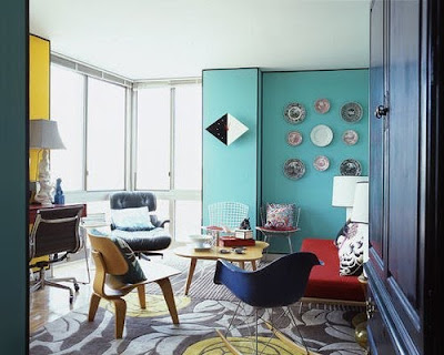
Flickr Features: THE Color of 2010: Turquoise!
One of our favorite things about this time of the year is all the interesting and exciting trend predictions for the new year. While there's nothing that is set in stone, we just love seeing all the creative ideas that experts think will be "hot" in the new year. For example, the Pantone Fashion Color Report for Spring 2010 has set out that a great color for next year will be a beautiful turquoise. Since we love this color, we went straight to the Coco+Kelley Flickr stream to find good-looking rooms that feature this inspiring color. Get ready for next year!


Monday, December 7, 2009
The Wild Colors and Patterns of the Memphis Group!
Today’s choice of a design influence might raise a few eyebrows. Glancing at the photos, it’s hard to hide the bright (almost garish) colors and strange shapes. Make no mistake, the Memphis Design Group was not only a surprising and important influence of design in the 1980s, its ideas, though subtle, have lasted until today.


The Memphis style of design is probably the most recognizable style, if only for its uniqueness. Probably the most jarring characteristic of the Memphis style of design is its use of bright colors and patterns. Featuring lots of teals, bright blues, purples, reds, greens and yellows along with signature black and grays, the colors were applied to furniture items in such a way that it really emphasized the shape of the pieces. Patterns that are undeniably 1980s, like zigzags, triangles and more, took residence on furniture planes. The shapes of the pieces were exuberant: pieces featured sharp angles and interesting curves.


Helmed by the great Ettore Sottass, the Italian movement began as a way to oppose the dark blacks and browns found in popular European furniture at the time. The movement was made up of other famous architects and designers who were all working in Milan at the time, like George Sowden, Michele de Lucchi, Marco Zanini, Aldo Cibic, Matheo Thun, Nathalie du Pasquier and Martine Bedin. Begun in 1980, the group created exhibits that ran annually from 1981 to 1988. Though these exhibits dealt with furniture and decorative accessories that featured crazy colors and shapes, this movement wasn’t outlandish or superficial. Sottass and his designers didn’t care for the way that furniture design was approached at the time—the Memphis movement and all of their unconventional shapes, patterns and colors were a way to try and develop a new creative approach to design.


While the Memphis group didn’t last long, and the pieces have proven a bit too trendy to ever really catch on as a sustainable style, the work that this design collective did remains important in that they challenged the traditional conventions of modern furniture making. This challenging of the traditional approaches to design may very well have led the way to other such unconventional furniture designs, movements and styles of recent years.


The Memphis style of design is probably the most recognizable style, if only for its uniqueness. Probably the most jarring characteristic of the Memphis style of design is its use of bright colors and patterns. Featuring lots of teals, bright blues, purples, reds, greens and yellows along with signature black and grays, the colors were applied to furniture items in such a way that it really emphasized the shape of the pieces. Patterns that are undeniably 1980s, like zigzags, triangles and more, took residence on furniture planes. The shapes of the pieces were exuberant: pieces featured sharp angles and interesting curves.

Helmed by the great Ettore Sottass, the Italian movement began as a way to oppose the dark blacks and browns found in popular European furniture at the time. The movement was made up of other famous architects and designers who were all working in Milan at the time, like George Sowden, Michele de Lucchi, Marco Zanini, Aldo Cibic, Matheo Thun, Nathalie du Pasquier and Martine Bedin. Begun in 1980, the group created exhibits that ran annually from 1981 to 1988. Though these exhibits dealt with furniture and decorative accessories that featured crazy colors and shapes, this movement wasn’t outlandish or superficial. Sottass and his designers didn’t care for the way that furniture design was approached at the time—the Memphis movement and all of their unconventional shapes, patterns and colors were a way to try and develop a new creative approach to design.

While the Memphis group didn’t last long, and the pieces have proven a bit too trendy to ever really catch on as a sustainable style, the work that this design collective did remains important in that they challenged the traditional conventions of modern furniture making. This challenging of the traditional approaches to design may very well have led the way to other such unconventional furniture designs, movements and styles of recent years.Thursday, November 12, 2009
Flickr Features: The Colors of Mid Century Modernism!
We show you plenty of great examples of Mid-Century Modern furniture, interiors and architecture here on the Swank Lighting blog, but something we often don't pay a lot of attention to is color. The Mid-Century era had its very own color scheme, and incorporating or finding inspiration from these colors can help bring a super retro-feel to your spaces--whether you bring them in on Mid-Century furniture or not. Perfect for paint colors, accessories and yes, even furniture, the colors found in these fun Flickr finds would look great in an interior meant to embody a Mid-Century Modern feel.
Thursday, November 5, 2009
Flickr Features: Colorful and Bold Interiors!
We guess we just can't get enough of Verner Panton's inspiring style of bright, bold and colorful furniture and interiors---we've had a colorful theme running through all of our posts all week! Today's post is no different: we've gathered some gorgeous and bold interior photos from Flickr. It takes a special person to decorate and live in a home with more than two or three bold and dominant colors, could you?
Monday, November 2, 2009
The Colorful and Psychedelic Designs of Verner Panton!
If you love 1960’s style design and are a big fan of color, then you’ll definitely want to check out today’s designer influence: Verner Panton. Considered by many to be one of Denmark's most important interior and furniture designers of the 20th-century, Panton’s use of shape and color not only summed up an entire generation of design, it continues to wow design enthusiasts today.


You probably are familiar with Panton’s work in terms of bright colors and distinctive chairs. His most famous furniture works were the Cone Chair (1958), the Peacock Chair, The Panton Chair of 1960 and the S Chair, but you may also recognize his other popular pieces like the Bachelor Chair, Trumpet Chair, Heart Cone Chair, Relaxer Chair, and his confusing Phantom Chair/Table.


As mentioned, Panton was also a huge proponent of color, often times blending hues in dizzying palettes. While his furniture was available in an array of bright and bold colors, it was in his experimental interior environments that his talent with colors was most evident, often crafting futuristic spaces with the uses of color and undulating wall, floor and furniture elements. He was also known for his lighting pieces (which also featured bold, bright, “1960s” styled elements) and his fabric ideas. He was often lauded for his innovative use of plastic materials in his work, also adding to the futuristic-feel of his projects.


Panton started his design training in the field of architectural engineering in the city Odense, Denmark, then moved on to study architecture at the Royal Danish Academy of Art Copenhagen. He worked under Arne Jacobsen right after college from 1950-1952, but quickly moved on to opening his own office soon after. Along with impressive interior, lighting, furniture and color design work, he also wowed experts and audiences alike with his incredible architectural ideas, like a collapsible house, the Cardboard House and the Plastic House. It was the year 1960 that saw Panton creating the most important design of his career, the world’s first single-form injection-molded plastic chair, The “Stacking chair” or “S chair”, which is still produced by companies like Vitra today.

The last years of his career saw his most work in interior environments, notably a German boat interior that is now a museum. Though it would be hard to imagine anyone actually living in any of his psychedelic interiors, it did pave the way for encouraging brighter and bolder ideas in home designs. Popular in the 1950s-1970s, Panton’s work had a resurgence in popularity in the early 2000s, and has taken its place alongside other design luminaries in the popular use of Mid-Century Modern style seen in homes and commercial spaces today.


You probably are familiar with Panton’s work in terms of bright colors and distinctive chairs. His most famous furniture works were the Cone Chair (1958), the Peacock Chair, The Panton Chair of 1960 and the S Chair, but you may also recognize his other popular pieces like the Bachelor Chair, Trumpet Chair, Heart Cone Chair, Relaxer Chair, and his confusing Phantom Chair/Table.


As mentioned, Panton was also a huge proponent of color, often times blending hues in dizzying palettes. While his furniture was available in an array of bright and bold colors, it was in his experimental interior environments that his talent with colors was most evident, often crafting futuristic spaces with the uses of color and undulating wall, floor and furniture elements. He was also known for his lighting pieces (which also featured bold, bright, “1960s” styled elements) and his fabric ideas. He was often lauded for his innovative use of plastic materials in his work, also adding to the futuristic-feel of his projects.


Panton started his design training in the field of architectural engineering in the city Odense, Denmark, then moved on to study architecture at the Royal Danish Academy of Art Copenhagen. He worked under Arne Jacobsen right after college from 1950-1952, but quickly moved on to opening his own office soon after. Along with impressive interior, lighting, furniture and color design work, he also wowed experts and audiences alike with his incredible architectural ideas, like a collapsible house, the Cardboard House and the Plastic House. It was the year 1960 that saw Panton creating the most important design of his career, the world’s first single-form injection-molded plastic chair, The “Stacking chair” or “S chair”, which is still produced by companies like Vitra today.
The last years of his career saw his most work in interior environments, notably a German boat interior that is now a museum. Though it would be hard to imagine anyone actually living in any of his psychedelic interiors, it did pave the way for encouraging brighter and bolder ideas in home designs. Popular in the 1950s-1970s, Panton’s work had a resurgence in popularity in the early 2000s, and has taken its place alongside other design luminaries in the popular use of Mid-Century Modern style seen in homes and commercial spaces today. Photos taken from 1stdibs.
Subscribe to:
Posts (Atom)


studiosmith
studiosmith
JAGwired
ezioman
Devil.Bunny
seier+seier+seier
back_garage
back_garage
back_garage
back_garage
back_garage
Architecture & Food
Architecture & Food
patti haskins
coco+kelley
coco+kelley

jinkazamah
coco+kelley

jimmyroq


urbaneapts